Break Down of “Never Alone” Figure Photo
*Note* This goes into details on the techniques I use for CS6 (PhotoShop / Bridge) and Lightroom. These techniques may be more geared towards intermediate PhotoShop users as I am still learning as I go along. In addition I will be going through my thought process and mistakes so this will be a rather long segment. ><
Here’s a high level recap that I have placed into G+ Figure Photography Community to create this photo:
- Deciding on a theme and pre-planning: Spend two to three days to decide a theme, initial figure selection for subject, and a web search for photography techniques I have not tried that’s somewhat viable with my gear. Find several background photos with the proper point of view.
- Photographing the figures matching the background’s lighting.
- Proofing the photos and initial cut.
- Export images out of Lightroom as JPEG.
- Import JPEG files into Photoshop layers via Adobe bridge.
- Photoshop techniques/filters used: Focus Stacking, Masking, Color Selection, Drop Shadows, Flatten layers but keep them, lens blur, Color Matching, clone/spot healing for dust removal.
Deciding on a theme and pre-planning
Personally this is the most important step since this is the foundation that everything is based upon. Techniques only help convey the idea; if the idea is not in focus then all the techniques in the world will be moot. Generally for Figure Fridays Challenge themes it’s one of two things after I read the topic; I have a rough shot formed in my mind already or I have no idea. In this case it was the latter. Over the course of two to three days, I spend about an hour or so to decide on a theme, re-evaluate my initial figure selection for the subject matter, and perform web searches for photography techniques that’s viable with my gear.
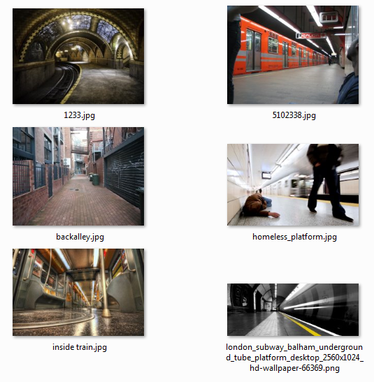
The theme, never alone, was found relatively quickly while searching for photography ideas. Once the theme was finalized, my figure choice was a teddy bear eraser sitting on my desk that I obtained as a gift from a friend’s birthday party for his daughter (G+ followers may recall a Repunzel piñata). The teddy bear usually is associated to a security item for many of us as a child and many of us can relate in some way. In addition I decided on Megahouse’s POP MILD Nico Robin to compliment the teddy bear. For this shot to work well, I needed a view on the same level as the figures to give it a more intimate feel. The next task was to find backgrounds that gave a sense of isolation and neglect to help emphasize Nico and her teddy bear’s companionship. Initially my search started off with ground level photos of run down building interiors, then to alleyways, followed by alleyways with dumpsters, by the third day I wasn’t satisfied the results I found.
The fourth day I stumbled upon a photo of an abandoned dog in the subway while passengers walked by. This lead me to searching for ground level photos for subway platforms and train interiors. Eventually I found the London subway background as my choice.
Photographing the figures
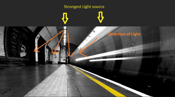
My theme and the London subway background photo selected; I now needed to get our figures photographed. To save time and extra work in Photoshop, I review the background photo for the strongest light source and its direction. This information will be used for the lighting to match the direction of light on the figures. Doing it this way cuts down the need to artificially add additional highlights, shadows, brightness on the figure.
My photography setup and gear used
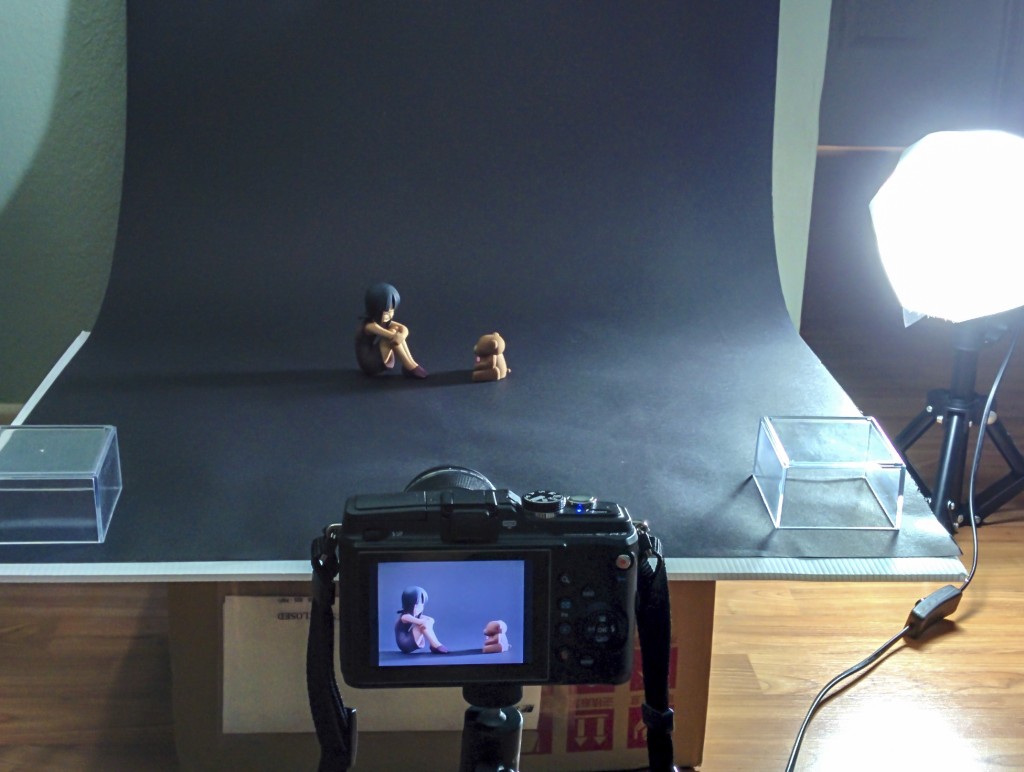
- Olympus PEN E-PL2 Micro Four Thirds camera
- Olympus MSC ED Macro 60mm f/2.8 Lens
- Giottos QU 305 tabletop Mini Tripod
- 2 x cowboy tabletop photolamps with Alzo Digital 27W Compact Fluorescent Daylight Balanced 5500K bulbs
- 2 x cotton linen covers for photolamps
- MyStudio 24-Inch/36-Inch black background photo paper

Setup for figure photo. Nothing fancy here.
Next is to shoot, shoot, shoot! I review the image between shots from the camera and compare it to the background subway photo on the screen. Then I correct the lights’ position/height, adjust the camera’s aperture, and shutter speed until I’m satisfied with the light and shadows on the figures. At this point adjusting the brightness of the figure to match the dim subway background does not come into play; I want a well lit figure photo that only mimics the direction of light.
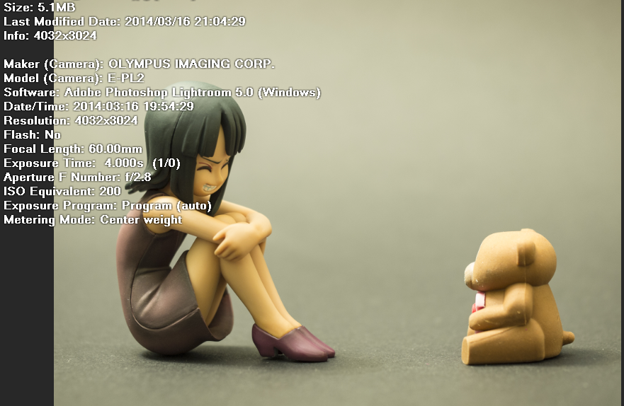
This point in the process is also where I would also try test shots and other items that may work with the background. After 5-8 shots and adjustments I didn’t get a satisfactory shot, I took a break and left my room light on and noticed the lighting fell pretty well on the figures. The output of the room light wasn’t too strong so I needed to adjust my shutter speed, set a timer so my hands do not shake the camera during the long exposure (I don’t have a remote trigger ^^; ). You can see the shot information below.

Using only the room light as the light source gave the best match when I compared the shot to the subway background.


